Harvard Business Review was always something of a Ferrari sitting in a Ford lot. Most of the "competition" was 1/5 our cover price, and there was almost no comparison in regard to the quality of the content. In 2016 we decided to lean into that distinction and use it to our advantage.
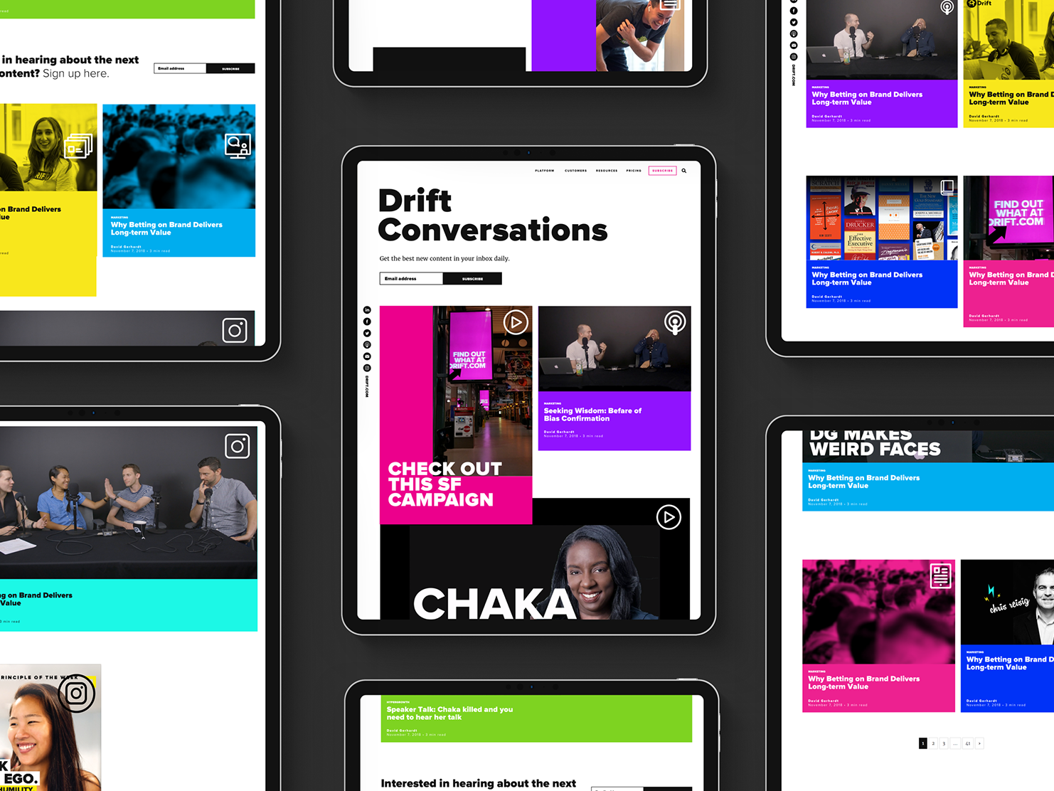
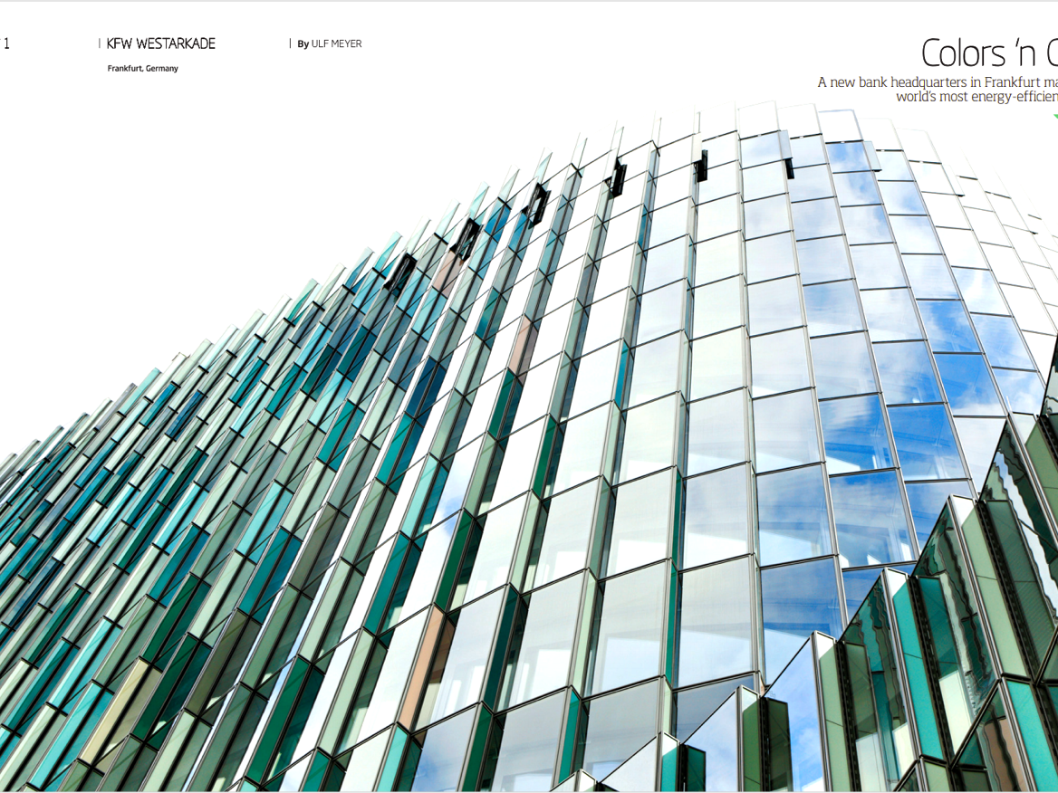
We introduced a top to bottom redesign in early 2017. We increased the overall size of the magazine, introduced better paper and a heavier cover, and completely redesigned every section. Our consumers exhibited very different behaviours when online vs when consuming the print issue and we wanted every aspect of that print edition to exude luxury and exclusivity. We further emphasised this by increasing the cover price significantly.
The results were not exactly as we expected. Although newsstand performance was fairly steady, we did see a marked increase in subscriptions.
— TEAM
Creative Director - James DeVries
Editor in Chief - Amy Bernstein
Designers - Annie Chin, Michael Tavilla, Heyon Shin
Photo Editor - Andrew Nguyen, Heyon Shin
— Recognition
Society of Publication Designers 2018 - Brand of the Year Finalist
Folio MIN 2017 - Best Redesign
Folio MIN 2016 - Best Magazine Media Brand
American Society of Magazine Editors 2015 - Nominated for General Excellence
