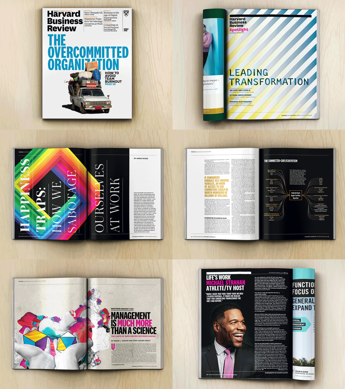
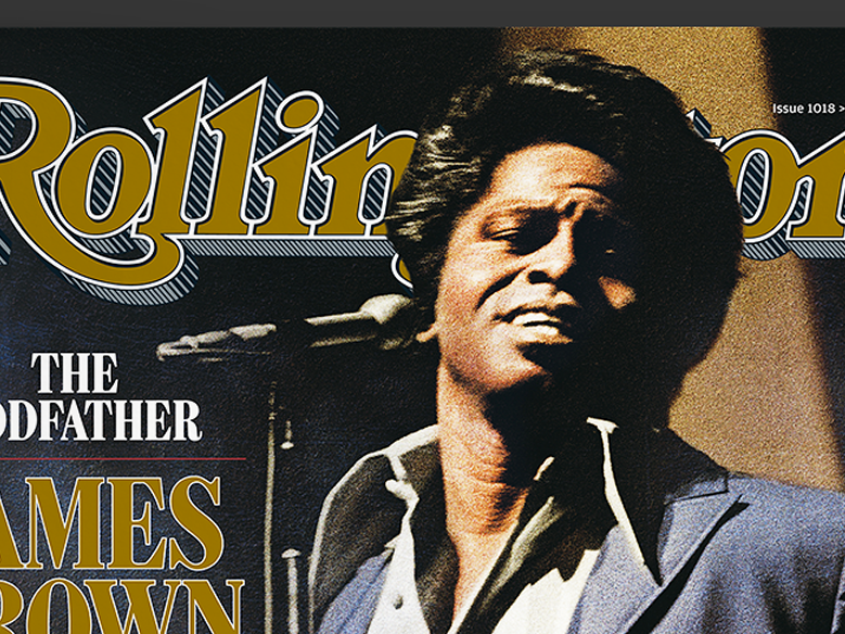
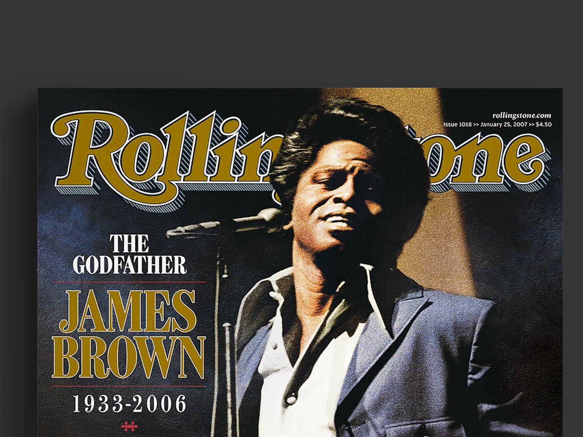
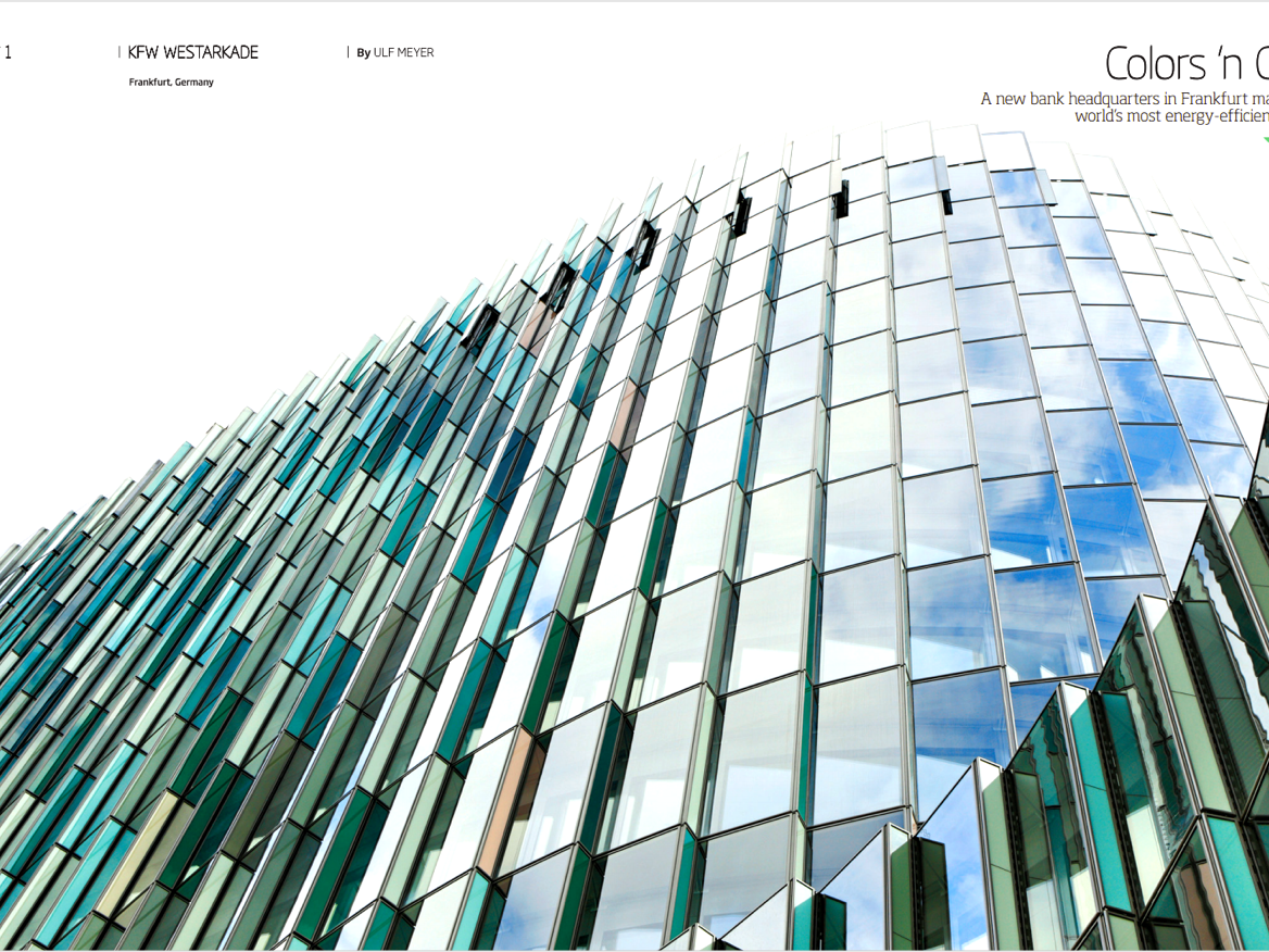
The brief was to take this fabulous resource and reinvent it to attract a wider readership, while finding a way to give the brand a higher impact visual appeal. EIC Joe Angio was ready for some dramatic change, and we worked together to rejuvenate not only the art direction, but the approach to feature packaging and cover treatments as well.
The challenge for the Art Department was to remake TONY as something that had the visual appeal of a monthly and the impact of a weekly. Joe (and subsequent EIC Brian Farnham) were willing accomplices when it came to pushing the conceptual envelope on the how to package the recurring content and were both very clever about how to produce NYC centric service content. Again I was blessed by having a great staff. Photo Editor Courtenay Kendall was the queen of can do production and produced a huge variety of ambitious shoots with little to no budget. And there was a giant team of designers and production people who toiled endlessly building the various sections of the book. In the end we gained some readers, won some awards and almost never had to wait for a table.
